The end of our last set of tutorials covered the FEAT interface; and although there is much more there to explore and use, such as MELODIC's independent component analysis, for now we will simplify things and focus on a traditional, straightforward univariate analysis.
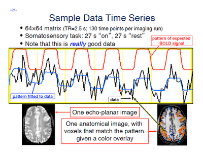
A few terms are worth defining here. First, whenever you read an instruction manual outlining how to set up and run a model with fMRI data, you will inevitably run into the term voxel-wise analysis. (Maybe not inevitably, but the point is, enough researchers and software packages use it to merit an acquaintance with it.) What this means is that we first construct a model of what we believe will happen at each voxel in the brain, given our timing files of what happened when. If, for example, ten seconds into the experiment the subject pressed a button with his right hand, we would expect to see a corresponding activation in the left motor cortex. When we talk about activation, we simply mean whether our model is a good fit or not for the signal observed in that voxel; and this model is generated by convolving - also known as the application of a moving average, a concept which is more easily explained through an animation found here - each event with a basis function, the most common and intuitive of which is a gamma function. Essentially what this boils down to is pattern matching in time; the better the fit for a particular contrast or condition, the more likely we are to believe that that particular voxel is responsive to that condition.
Furthermore, within the output of FEAT you will see plotted timecourses for each peak voxel for each contrast. The red line represents the raw signal timeseries at that voxel, which, as you can see, is relatively noisy, although it is clear when certain conditions were present. It should be noted that this experiment is a special case, as we are dealing with a block design which elicits robust activation in the left and right motor cortices; most studies employing event-related designs have much noisier data which is much more difficult to interpret. The blue line represents the complete model fit; that is, given all of the regressors, whether any activation in this voxel can be attributed to any of your conditions. Lastly, the green line represents only the contrast or condition of interest, and is usually only meaningful when looking at simple effects (i.e., undifferentiated contrasts which compare only one condition to the baseline signal present in the data).
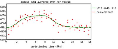
One feature not covered in this video tutorial is the visualization of peristimulus plots, which allow the user to see averages of the event over multiple repetitions. It provides much of the same information as the basic timeseries plots, but from a slightly different vantage point; you can see what timepoints are averaged, exactly, and how this contributes to the observed model fit.
Now that you have had FEAT guide you by the hand through your results, it is time to get down and dirty and look at your results in the output directories by yourself. FEAT generates a lot of output, but only a fraction of it is worth investigating for the beginning researcher, and almost all of it can be found in the stats directory. We will cover this in the following tutorial; for now, check your freezer for Hot Pockets.


