Regional Homogeneity Analysis, Part IV: Normalizing Correlation Maps

Once 3dReHo is completed and you have your correlation maps, you will then need to normalize them. Note that normalize can have different meanings, depending on the context. With FMRI data, when we talk about normalization we usually mean normalizing the data to a standard space so that individual subjects, with all of their weird-looking, messed-up brains, can be compared to each other. This results in each subject's brain conforming to the same dimensions and roughly the same cortical topography as a template, or "normal" brain, which in turn is based on the brain of an admired and well-loved public figure, such as 50 Cent or Madonna.

However, normalization can also refer to altering the signal in each voxel to become more normally distributed. This makes the resulting statistical estimates - whether betas, correlation coefficients, or z-scores - more amenable for a higher-level statistical test that assumes a normal distribution of scores, such as a t-test. Although there are a few different ways to do this, one popular method in papers using ReHo is to take the mean Kendall's Correlation Coefficient (KCC) of all voxels in the whole-brain mask, subtract that mean from each voxel, and divide by the KCC standard deviation across all voxels in the whole-brain mask.

As a brief intermezzo before going over how to do this in AFNI, let us talk about the difference between 3d and 1d tools, since knowing what question you want to answer will direct you toward which tool is most appropriate for the job. 3d tools - identified by their "3d" prefix on certain commands, such as 3dTfitter or 3dDeconvolve - take three-dimensional data for their input, which can be any three-dimensional dataset of voxels, and in general any functional dataset can be used with these commands. Furthermore, these datasets usually have a temporal component - that is, a time dimension that is the length of however many images are in that dataset. For example, a typical functional dataset may have several voxels in the x-, y-, and z-directions, making it a three-dimensional dataset, as well as a time component of one hundred or so timepoints, one for each scan that was collected and concatenated onto the dataset.

1d tools, on the other hand, use one-dimensional input, which only goes along a single dimension. The ".1D" files that you often see input to 3dDeconvolve, for example, have only one dimension, which usually happens to be time - one data point for every time point. Since we will be extracting data from a three-dimensional dataset, but only one value per voxel, then, we will use both 3d and 1d tools for normalization.

Once we have our regional homogeneity dataset, we extract the data with 3dmaskdump, omitting any information that we don't need, such as the coordinates of each voxel using the -noijk option:

3dmaskdump -noijk -mask mask_group+tlrc ReHo_Test_Mask+tlrc > ReHo_Kendall.1D

Note also that the -mask option is using the whole-brain mask, as we are only interested in voxels inside the brain for normalization.

The next step will feed this information into 1d_tool.py, which calculates the mean and standard deviation of the Kendall correlation coefficients across all of the voxels:

1d_tool.py -show_mmms -infile ReHo_Kendall.1D

Alternatively, you can combine both of these into a single using the "|" character will feed the standard output from 3dmaskdump into 1d_tool.py:

3dmaskdump -noijk -mask mask_group+tlrc ReHo_Test_Mask+tlrc | 1d_tool.py -show_mmms -infile -

Where the "-" after the -infile option means to use the standard output of the previous command.

3dcalc is then used to create the normalized map:

3dcalc -a ReHo_Test_Mask+tlrc -b mask_group+tlrc -expr '((a-0.5685)/0.1383*b)' -prefix ReHo_Normalized

Lastly, although we have used the whole brain for our normalization, a strong argument can be made for only looking at voxels within the grey matter by masking out the grey matter, white matter, and cerebrospinal fluid (CSF) separately using FreeSurfer or a tool such as 3dSeg. The reason is that the white matter will tend to have lower values for Kendall's correlation coefficient, and grey matter will have relatively higher values; thus, normalizing will bias the grey matter to have higher values than the grey matter and CSF. However, one could counter that when a second-level test is carried out across subjects by subtracting one group from another, it is the relative differences that matter, not the absolute number derived from the normalization step.

In sum, I would recommend using a grey mask, especially if you are considering lumping everyone together and only doing a one-sample t-test, which doesn't take into account any differences between groups. As with most things in FMRI analysis, I will leave that up to your own deranged judgment.


Regional Homogeneity Analysis, Part III: Running 3dReHo

Before moving on to using 3dReHo, we need to first ask some important rhetorical questions (IRQs):
  • Did you know that with the advent of free neuroimaging analysis packages and free online databanks, even some hirsute weirdo like you, who has the emotional maturity of a bag full of puppies, can still do FMRI analysis just like normal people?
  • Did you know that it costs ten times as much to cool your home with air conditioning than it does to warm it up?
  • Did you know that Hitler was a vegetarian?
  • Did you know that over thirty percent of marriages end by either knife fights or floss strangulation?
Once we have thought about these things long enough, we can then move on to running 3dReHo, which is much less intimidating than it sounds. All the command requires is a typical resting state dataset which has already been preprocessed and purged of motion confounds, as well as specifying the neighborhood for the correlation analysis; in other words, how many nearby voxels you want to include in the correlation analysis. For each voxel 3dReHo then calculates Kendall's Correlation Coefficient (KCC), a measure of how well the timecourse of the current voxel correlates with its neighbors.

3dReHo can be run with only a prefix argument and the input dataset (for the following I am using the preprocessed data of subject 0050772 from the KKI data analyzed previously):

3dReHo -prefix ReHoTest -inset errts.0050772+tlrc

The default is to run the correlation for a neighborhood of 27 voxels; that is, for each voxel touching the current voxel with either a face, edge, or corner. This can be changed using the -nneigh option to either 7 or 19. In addition, you can specify a radius of voxels to use as a neighborhood; however, note that this radius is in voxels, not millimeters.

E.g.,

3dReHo -prefix ReHo_9 -inset errts.0050772+tlrc -nneigh 9

Or:

3dReHo -prefix ReHo_rad3 -inset errts.0050772+tlrc -neigh_RAD 3


Lastly, if your current dataset has not already been masked, you can supply a mask using the -mask option, which can either be a whole-brain mask or a grey-matter mask, depending on which you are interested in. For the KKI dataset, which is not masked during the typical uber_subject.py pipeline, I would use the mask_group+tlrc that is generated as part of the processing stream:

3dReHo -prefix ReHo_masked -inset errts.0050772+tlrc -mask mask_group+tlrc

This is demonstrated in the following video, which was recorded shortly before I was assaulted by my girlfriend with dental floss. Unwaxed, of course. (She knows what I like.)


Regional Homogeneity Analysis, Part II: Processing Pipelines

For regional homogeneity analysis (ReHo), many of the processing steps of FMRI data remain the same: slice-timing correction, coregistration, normalization, and many of the other steps are identical to traditional resting-state analyses. However, the order of the steps can be changed, depending on whatever suits your taste; as with many analysis pipelines, there is no single correct way of doing it, although some ways are more correct than others.

One of the most comprehensive overviews of ReHo processing was done by Maximo et al (2013), where datasets were processed using different types of signal normalization, density analysis, and global signal regression. I don't know what any of those terms mean, but I did understand when they tested how smoothness affected the ReHo results. As ReHo looks at local connectivity within small neighborhoods, spatial smoothing can potentially inflate these correlation statistics by averaging signal together over a large area and artificially increasing the local homogeneity of the signal. Thus, smoothing is typically done after ReHo is applied, although some researchers eschew it altogether.

So, should you smooth? Consider that each functional image already has some smoothness added to it when it comes directly off the scanner, and also that any transformation or movement of the images introduces spatial interpolation as well. Further, not all of this interpolations and inherent smoothness will be exactly the same for each subject. Given this, it makes the most sense to smooth after ReHo has been applied, but also to use a tool such as AFNI's 3dFWHMx to smooth each image to the same level of smoothness; however, if that still doesn't sit well with you, note that the researcher's from the abovementioned paper tried processing pipelines both with and without a smoothing step, and found almost identical results for each analysis stream.

Taken together, most of the steps we used for processing our earlier functional connectivity data are still valid when applied to a ReHo analysis; we still do the basic preprocessing steps, and still run 3dDeconvolve and 3dSynthesize commands to remove confounding motion effects from our data. However, we will only do smoothing after all of these commands have been run, and use 3dFWHMx to do it instead of 3dmerge.

One last consideration is the neighborhood you will use for ReHo. As a local connectivity measure, we can specify how much of the neighborhood we want to test for correlation with each voxel; and the most typical options are using immediate neighbors of 7, 19, or 27 voxels, which can be specified in the 3dReHo command with the -nneigh option. "7" will mean to consider only those neighboring voxels with one face touching; "19" will calculate the time-series correlation with any voxel touching with a face or an edge (e.g., a straight line bordering the current voxel); and "27" will do the analysis for any voxel with an abutting face, edge, or corner (think of it as the test voxel in the center of a Rubik's cube, and that voxel being correlated with every other voxel in the cube).


In the next part, we will go over some important rhetorical questions, along with a video showing how the command is done.

Regional Homogeneity Analysis with 3dReHo, Part 1: Introduction

Learning a new method, such as regional homogeneity analysis, can be quite difficult, and one often asks whether there is an easier, quicker method to become enlightened. Unfortunately, such learning can only be accomplished through large, dense books. Specifically, you should go to the library, check out the largest, heaviest book on regional homogeneity analysis you can find, and then go to the lab of someone smarter than you and threaten to smash their computer with the book unless they do the analysis for you.

If for some reason that isn't an option, the next best way is to read how others have implemented the same analysis; such as me, for example. Just because I haven't published anything on this method, and just because I am learning it for the first time, doesn't mean you should go do something rash, such as try to figure it out on your own. Rather, come along as we attempt to unravel the intriguing mystery of regional homogeneity analysis, and hide from irate postdocs whose computers we have destroyed. In addition to the thrills and danger of finding things out, if you follow all of the steps outlined in this multi-part series, I promise that you will be the first one to learn this technique from a blog. And surely, that must count for something.

With regional homogeneity analysis (or ReHo), researchers ask similar questions as with functional connectivity analysis; however, in the case of ReHo, we correlate the timecourse in one voxel with its immediate neighbors, or with a range of neighbors within a specified radius, instead of using a single voxel or seed region and testing for correlations with every other voxel in the brain, as in standard functional connectivity analysis.

As an analogy, think of ReHo as searching for similarities in the timecourse of the day's temperature between different counties across a country. One area's temperature timecourse will be highly correlated with neighboring counties's temperatures, and the similarity will tend to decrease the further away you go from the county you started in. Functional connectivity analysis, on the other hand, looks at any other county that shows a similar temperature timecourse to the county you are currently in.

Similarly, when ReHo is applied to functional data, we look for differences in local connectivity; that is, whether there are differences in connectivity within small areas or cortical regions. For example, when comparing patient groups to control groups, there may be significantly less or significantly more functional connectivity in anterior and posterior cingulate areas, possibly pointing towards some deficiency or overexcitation of communication within those areas. (Note that any differences found in any brain area with the patient group implies that there is obviously something "wrong" with that particular area compared to the control group, and that the opposite can never be true. While I stand behind this arbitrary judgment one hundred percent, I would also appreciate it if you never quoted me on this.)

As with the preprocessing step of smoothing, ReHo is applied to all voxels simultaneously, and that the corresponding correlation statistic in each voxel quantifies how much it correlates with its neighboring voxels. This correlation statistic is called Kendall's W, and ranges between 0 (no correlation at all between the specified voxel and its neighbors) and 1 (perfect correlation with all neighbors). Once these maps are generated, they can then be normalized and entered into t-tests, producing similar maps that we used with our functional connectivity analysis.

Now that we have covered this technique in outline, in our next post we will move on to the second, more difficult part: Kidnapping a senior research assistant and forcing him to do the analysis for us.

No, wait! What I meant was, we will review some papers that have used ReHo, and attempt to apply the same steps to our own analysis. If you have already downloaded and processed the KKI data that we used for our previous tutorial on functional connectivity, we will be applying a slightly different variation to create our ReHo analysis stream - one which will, I hope, not include federal crimes or destroying property.

Head Motion and Functional Connectivity

Yesterday as I was listening to a talk about diffusion tensor imaging, a professor asked about the influences of head motion on DTI data, and whether it could lead to spurious effects. Another professor vigorously denied it, stating that it was much more of a problem for bread and butter FMRI analyses, and in particular resting state functional connectivity analyses. At one point he became so animated that his monocle fell off, his collar stud came undone, and eventually he had to be physically restrained by the people sitting next to him. It was then that I knew that I should pay heed, for it is unlikely that a scientist becomes highly excited and talkative over matters that are trivial; in short, I could sense that he was talking about something important.

I have done few functional connectivity analyses in my brief life, but what I understand about them is this: You take the timecourse of one voxel - or the average timecourse over a group of voxels, also known as a "seed" - and then compare that timecourse with the timecourse of every other voxel in the brain. (When I speak of timecourses, I mean the sampled signal over time.) If it is a good fit - in other words, if there is a significantly high correlation between the timecourses - then we say that the two regions are functionally connected. This is a bit of a misnomer, as we cannot make any direct inferences about any "real" connectivity from two correlated timecourses; but it can serve as a good starting point for more sophisticated analyses, such as psychophysiological interactions (PPI; also known as context-dependent correlations) which measure changes in functional connectivity as a function of task context. For example: Does the timecourse correlation between cognitive control regions and reward-related areas change depending on whether the subject is instructed to upregulate or downregulate their gut reactions to rewarding stimuli?

One of the most popular variations of functional connectivity is something called resting state functional connectivity (rsFC), where a subject is simply instructed to relax and listen to Barry Manilow* while undergoing scanning. Functional connectivity maps are then calculated, and usually a comparison is made between a control group and an experimental or patient group, such as schizophrenics. For us FMRI researchers, this is about as close as we can get to simulating a person's natural environment where they would be relaxing and thinking about nothing in particular; except that they're in an extremely tight-fitting, noisy tube, and unable to move in any direction more than a few millimeters. Other than that, though, it's pretty normal.

These types of experiments have become all the rage in recent years, with several studies claiming to have found meaningful resting-state differences between healthy controls and several different patients populations such as schizophrenics, depressives, Nickelback fans, and drug addicts. However, a few publications have called into question some of these results, stating that many of these differences could be due to head motion. As we've talked about before, head motion can be a particularly insidious confound in any experiment, but it is especially troublesome for functional connectivity analyses. This can arise due to systematic differences between control and patient populations that are possibly confounded with motion. Take, for example, an experiment contrasting young versus older populations. Older populations are known to move more, and any observed differences in functional connectivity may be due solely to this increased motion, not underlying neural hemodynamics.

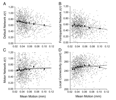
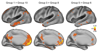
A study by Van Dijk, Sabuncu, & Bruckner (2012) looked at this in detail by scanning over a thousand (!) subjects, and binning them into ten groups based on increasing amounts of motion (e.g., group 1 had the least amount of motion, while group 10 had the most motion). The authors found decreased functional connectivity in the "default network" of the brain - usually referring to the functional connectivity between the medial prefrontal cortex and retrosplenial cingulate cortex -, decreased connectivity in the frontal-parietal network, and slightly increased local connectivity among clustered voxels, simply based on motion alone. (Keep in mind that each bin of subjects were matched as closely as possible on all other demographic measures.) Furthermore, even when comparing bins of subjects closely matched for motion (e.g., bins 5 and 6), small but significant differences in functional connectivity were seen.

Figure 3 from Van Dijk et al (2012). Functional connectivity among different networks measured as a function of head motion. Both linear and nonlinear (quadratic) terms were modeled to fit the data.

Figure 4 from Van Dijk et al (2012). Note the comparison on the far right between groups 5 and 6; the mean motion difference between these two groups is a few thousandths of a millimeter, but noticeable functional connectivity differences are still seen between the two groups.

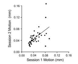
Lastly, a subset of subjects were rescanned in order to see whether motion was reliable; in other words, if a subject that moved a large amount on one day had the same tendency to move a large amount on the next day. A clear correlation was found between scanning subjects, suggesting that motion might need to be treated as a trait or individual difference, just like any other.

Figure 5 from Van Dijk et al (2012). There is a robust correlation between the movement of scanning sessions, even with the outliers removed (marked in diamonds).

So, what to do? A few recommendations are to match subjects for motion, correct motion prospectively (Ward et al, 2000), and regress out motion when performing a group-level analysis, as you would any other covariate. Apparently traditional methods of motion correction on a subject-by-subject basis are not enough, and increasing awareness of the pitfalls of between-subject motion is important for evaluating current functional connectivity analyses, and for conducting your own experiments.

This study hit me in the face like a wet mackerel since I am beginning to investigate a recent AFNI tool, 3dReHo, to do local functional connectivity analyses for publicly available datasets on the ABIDE website. However, as far as I can tell, motion limits were not used as exclusionary criteria, which may be a possible confound when examining, say, autistic children to controls. More to come soon. Or not.


*I Don't Want to Walk Without You